Sapience Network
About This Project
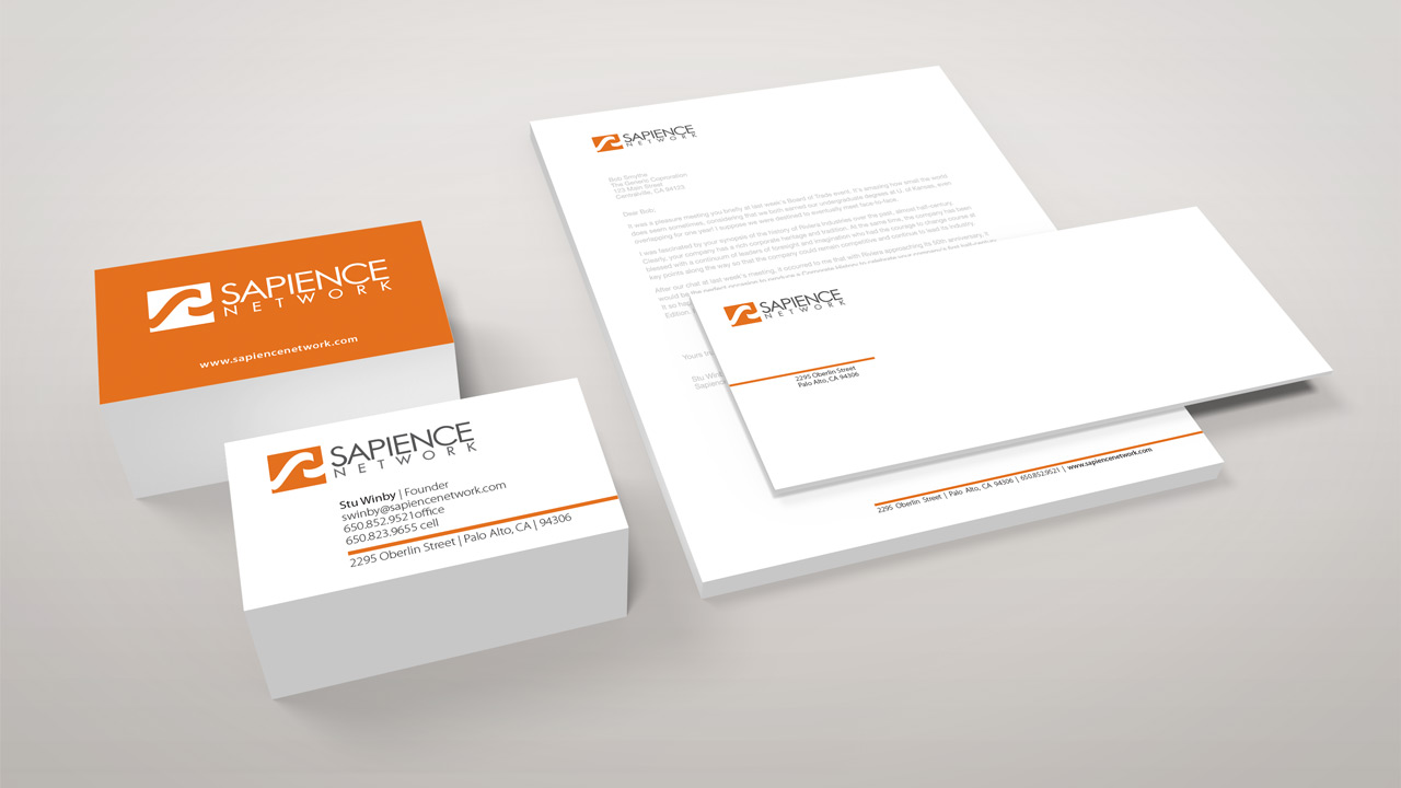
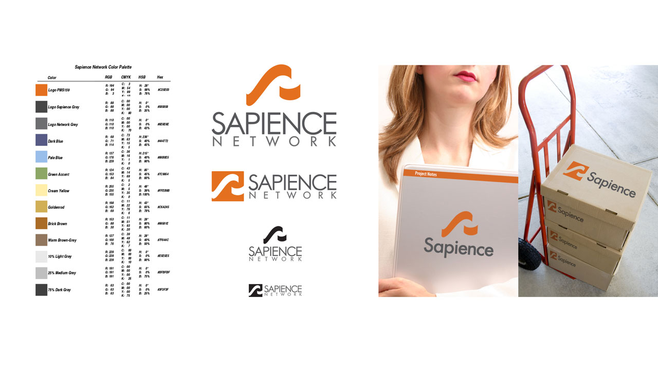
Logo design and identity system for Sapience Network, an innovation consultancy. Sapience Network works primarily with Fortune 100 corporations, focusing on the healthcare industry.
The design concept behind the logo mark came from the graph of a product’s design cycle. The large “S” and the smaller upswept arc in the logo represent the “sweet spot” of a design cycle, representing the place where the greatest change to process and product can happen in the overall graph of a products life cycle.
Responsibilities
Logo design & Identity System, Print collateral, Template design, Web design